Getting started with TeamOrgChart
- SharePoint Online or Office 365 users: Installing from the O365 or SP Online store
- AAD users: Installing via Microsoft Entra ID
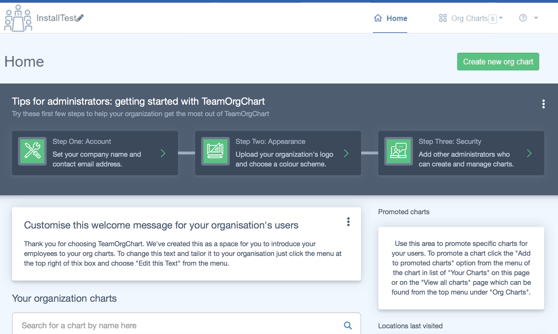
When you first install and log in to TeamOrgChart you'll see this screen. This guide will take you through customizing your first chart. To create a chart from the homepage simply click the green "Create new org chart" button at the top right of the screen.
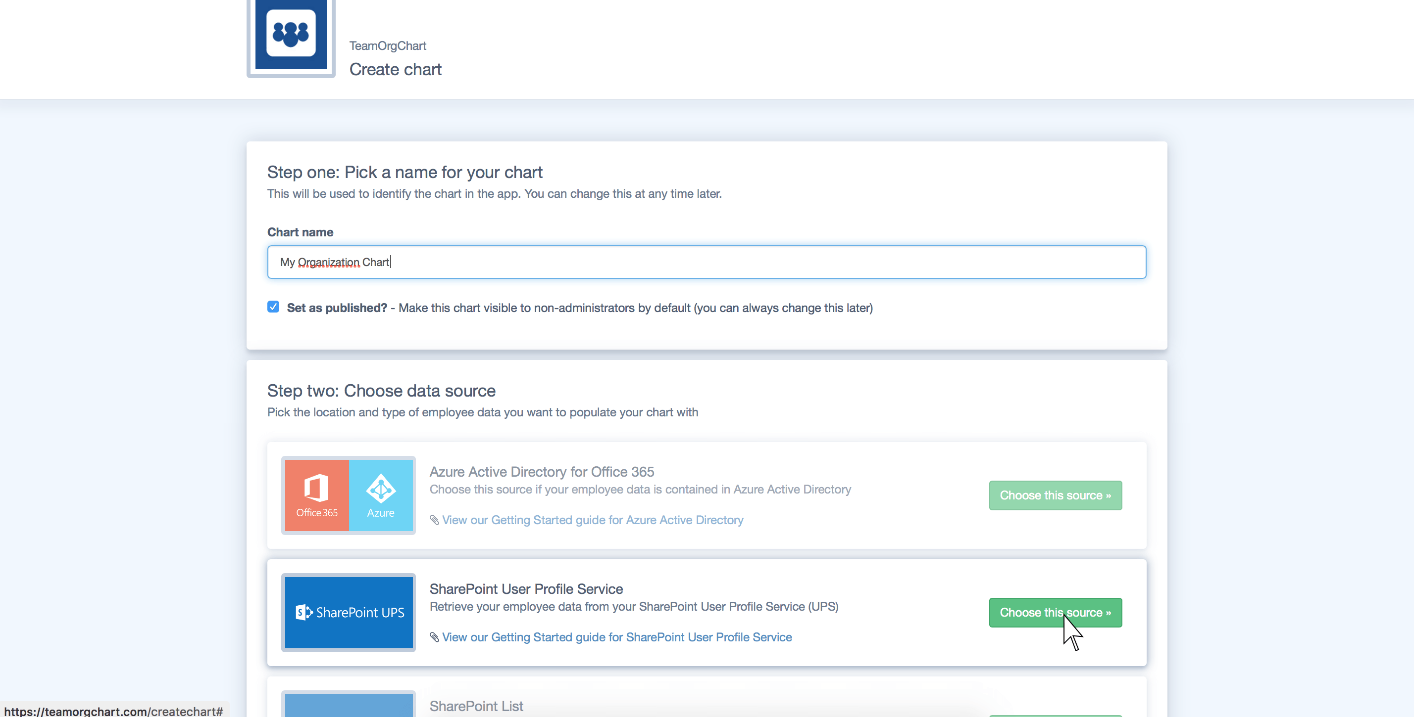
You will then be asked to choose a name and data source for your new chart. For the purposes of this guide we'll be using the SharePoint User Profile Service (UPS) but the steps in this guide will apply to any of the data sources.
We won't be going into any detail on the different data sources in this guide, but if you'd like help with the chart creation process for your chosen data source please select one of the guides below:
- SharePoint User Profile Service
- Quick start: SharePoint List
- Azure Active Directory
- Excel spreadsheet/CSV
- Manually entering employee data
Once you have chosen a data source and proceeded through the import steps you should be presented with a chart showing your organization structure.
Note: If you do not see your organization structure please ensure you have selected a valid starting person and your employee data is up to date with correct manager/employee relationships.
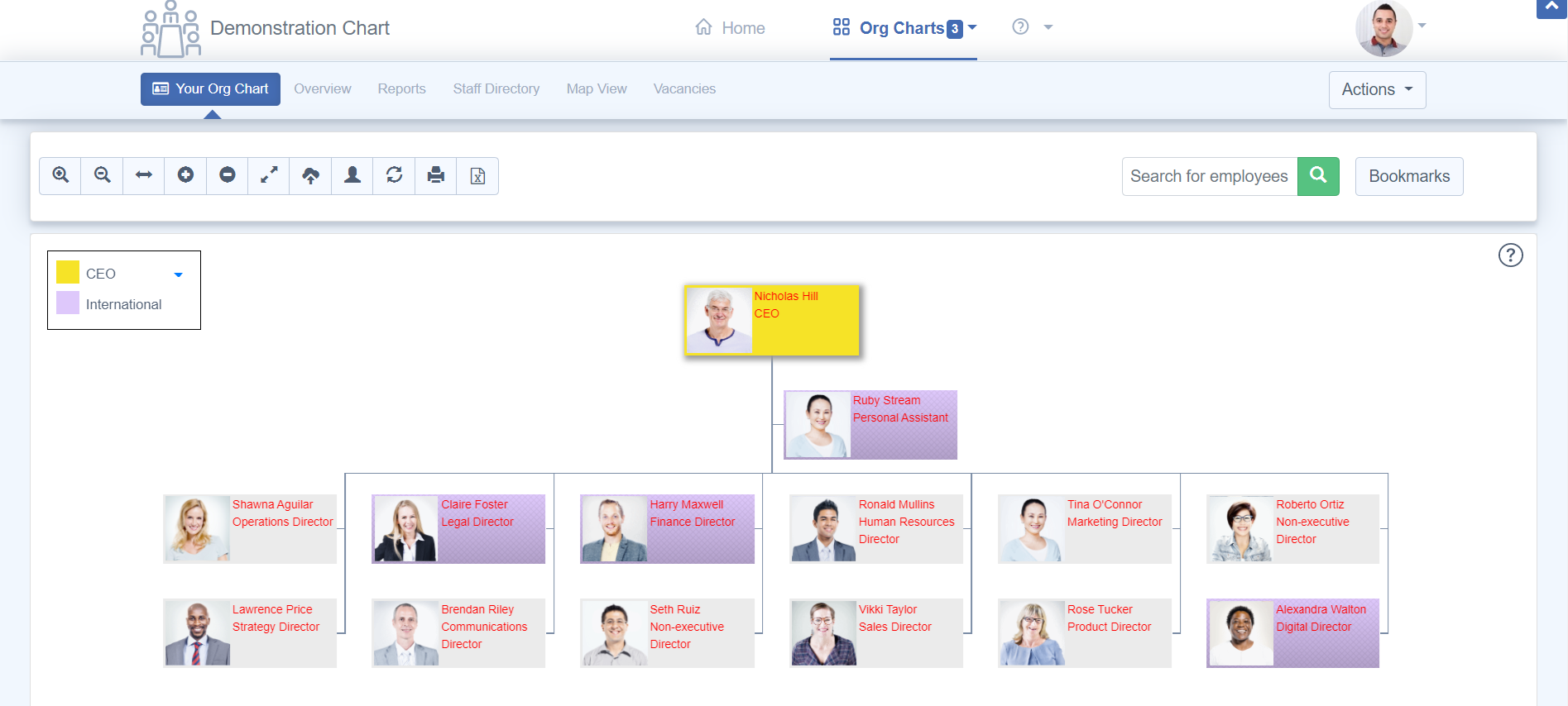
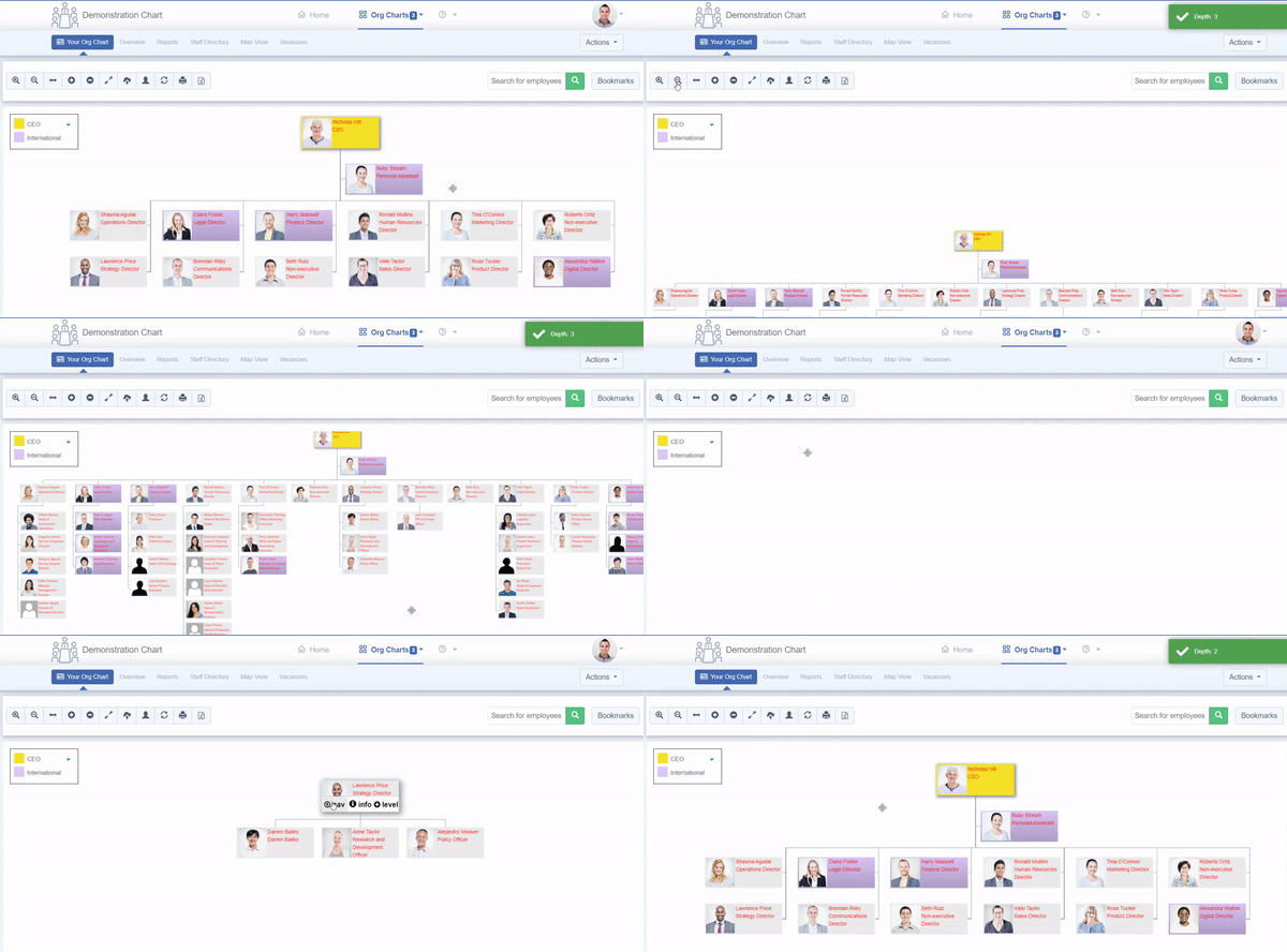
You can explore a chart in a number of different ways:
- Add and remove levels of your chart using the buttons in the toolbar to show/hide employees from your chart view
- Zoom in and out using the buttons in the toolbar to see a different picture of your organization
- Click and drag your chart to move around your organization
- Refocus the top of your chart by clicking on the blue up/down arrows next to the chart boxes to isolate particular areas of your organization.
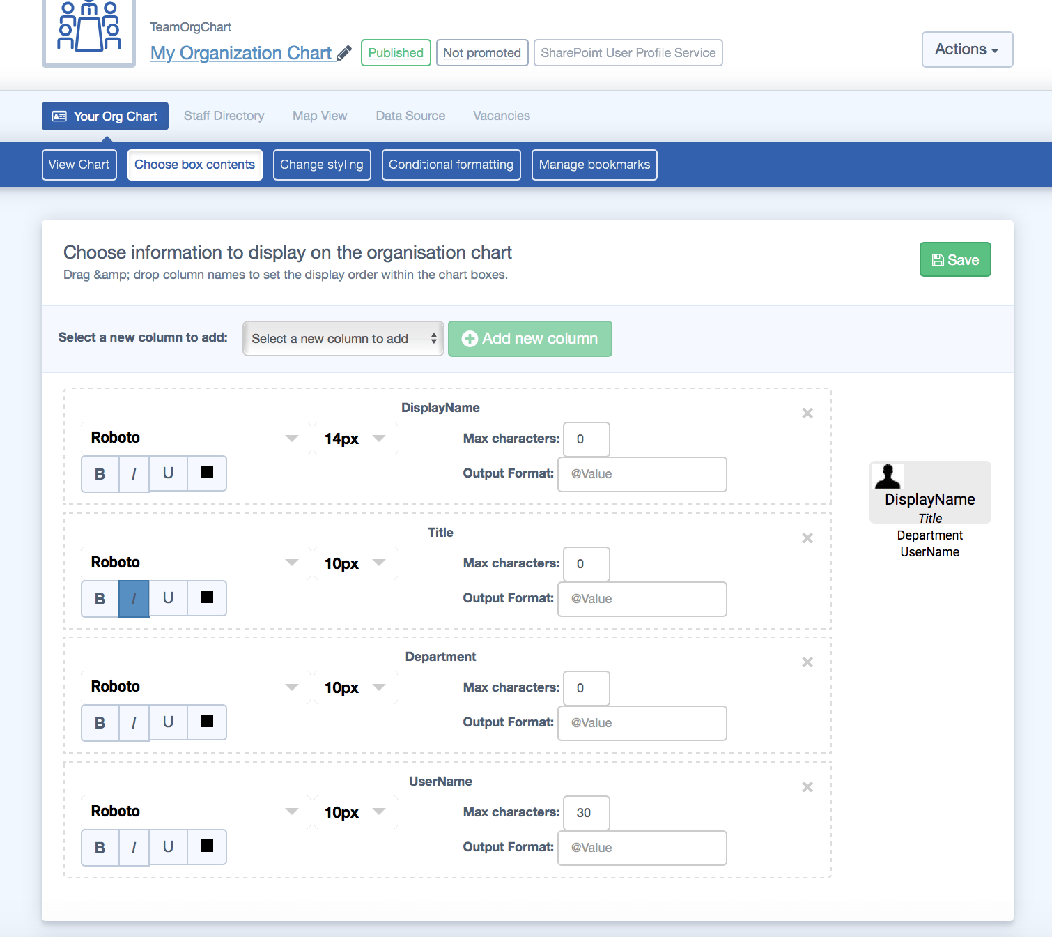
Configuring what data displays in each chart box is easy. Simply click on the "Choose box contents" button in the navigation bar above your chart, and use the controls below to add, remove and style box contents. You can also reorder the contents by dragging each data box. For instance:
- Increase the size of the DisplayName field and make it bold
- Italicize the Title field
- Adding a new Department field
- Adding a new UserName field and setting a maximum character length of 30
Once you save your changes you can return to the chart and see the effects of your changes. In the next step we'll improve the styling.
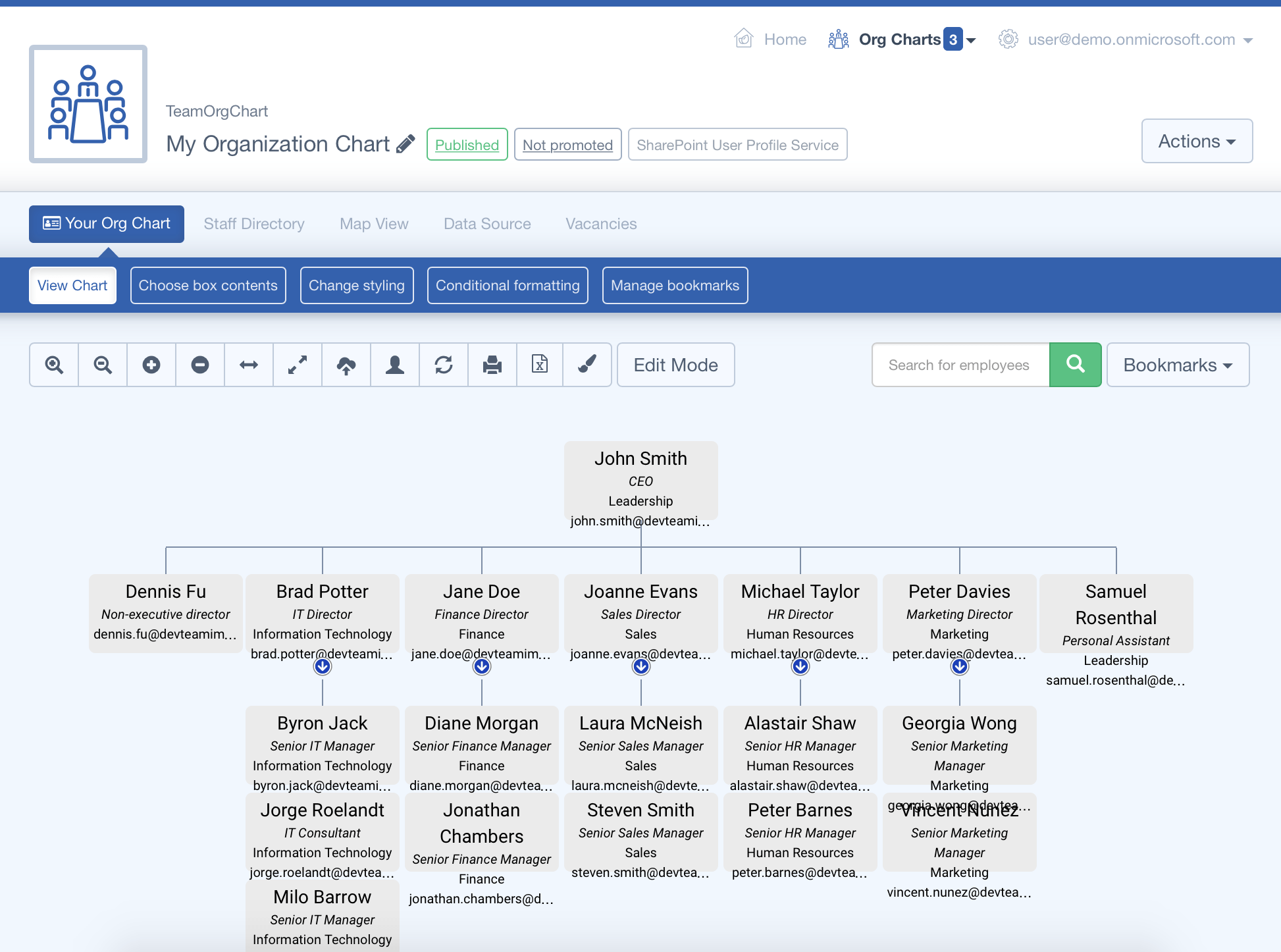
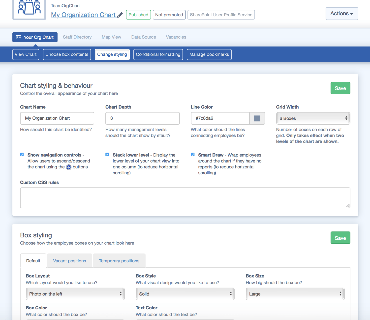
In our example the chart boxes now look a bit cramped. We'll use the "Box styling" options on the "Change styling" page to improve the appearance. We've made the following changes:
- Set the box layout to "Photo on the left" to incorporate our employee profile pictures*
- Set the Box Size to large to allow for more space in the chart boxes
Save your changes and return to your chart. In the second screenshot you can see the effects of our changes.
*Note: Configuring profile photos from your SP/AAD/O365 data can require additional steps. Please see this guide on configuring profile pictures to learn more
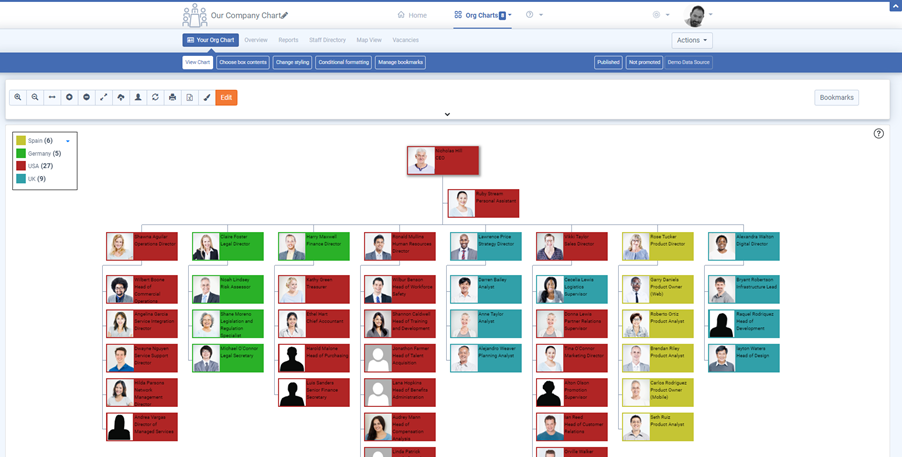
You can create rules on the "Conditional Formatting" page to change the styling of chart boxes based on specific criteria.
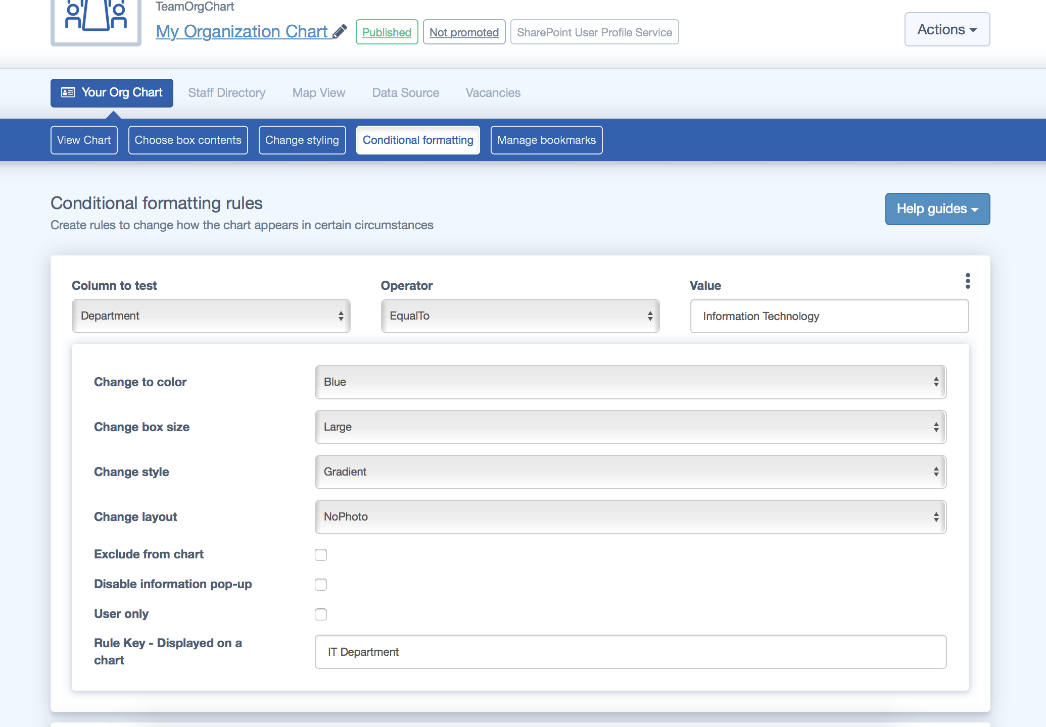
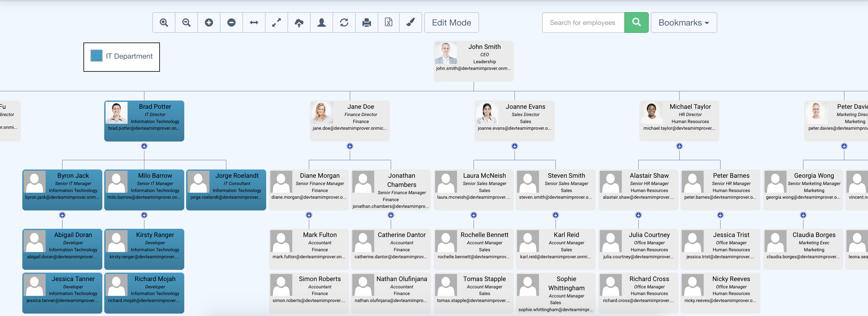
In this example we create a rule to change all the employees in the Information Technology department to blue before saving and returning to the chart.
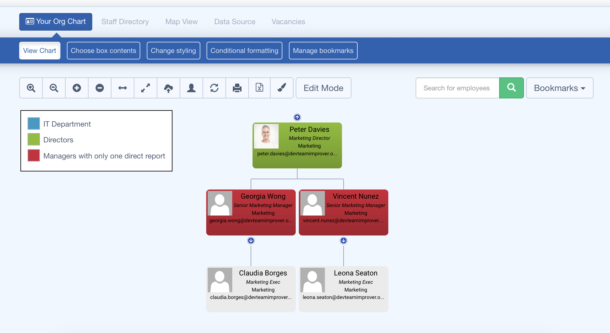
Also note how a key now appears on the chart, with the text entered in the "Rule Key" field on the Conditional Formatting page.
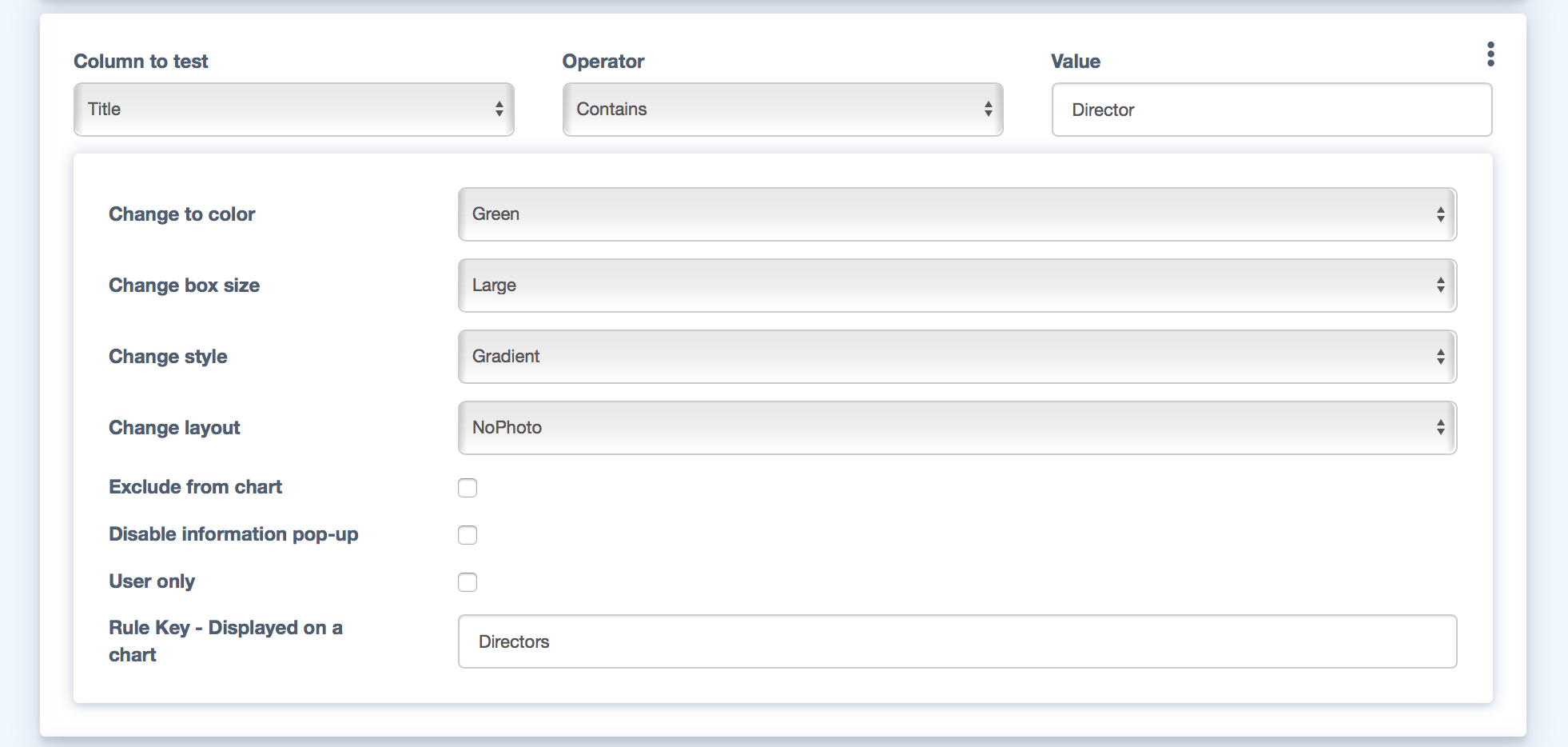
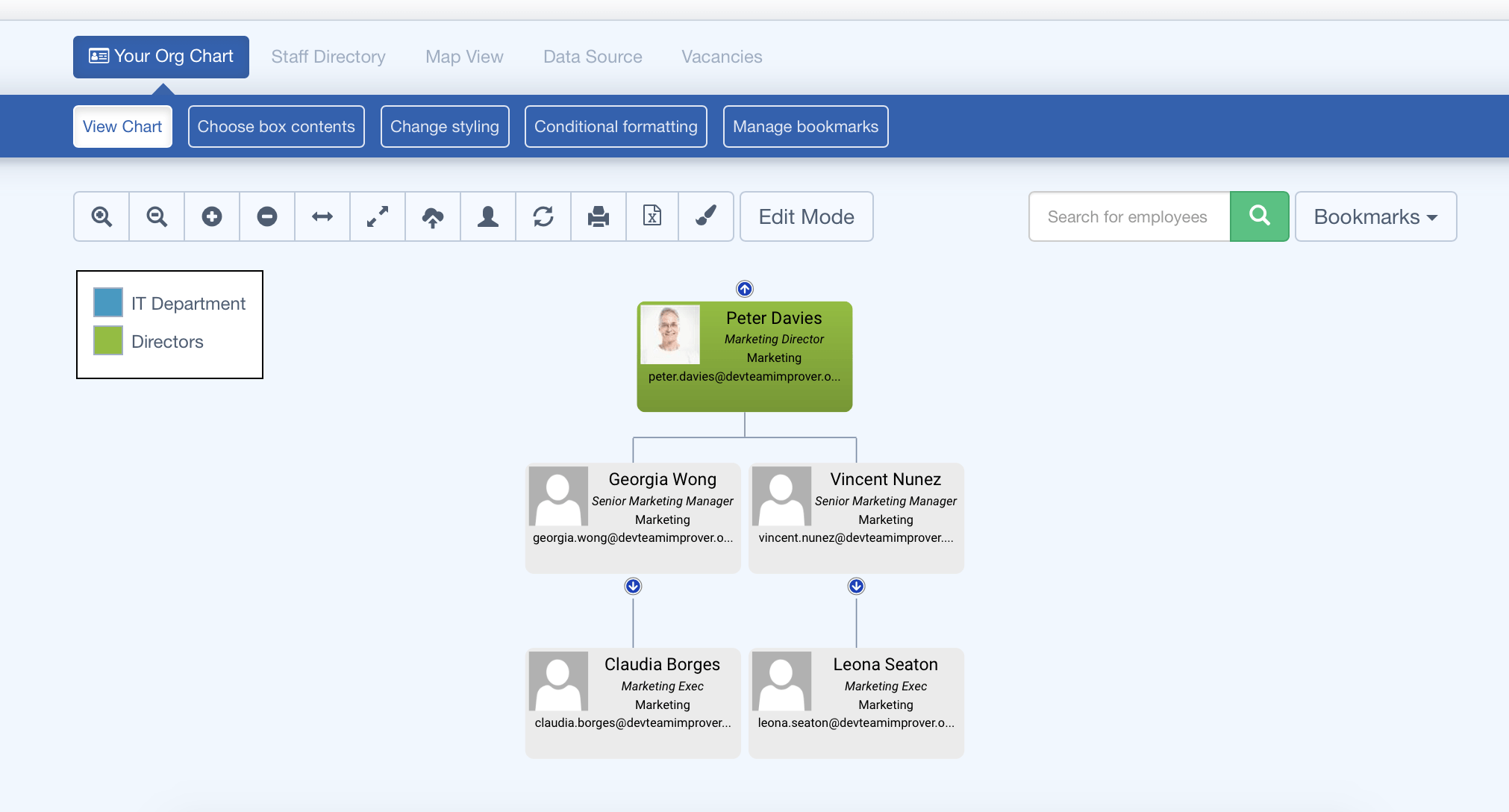
In this example we will create a conditional formatting rule to check if the JobTitle of an employee contains the word "Director".
If that condition is met we want to style the chart boxes to be green.

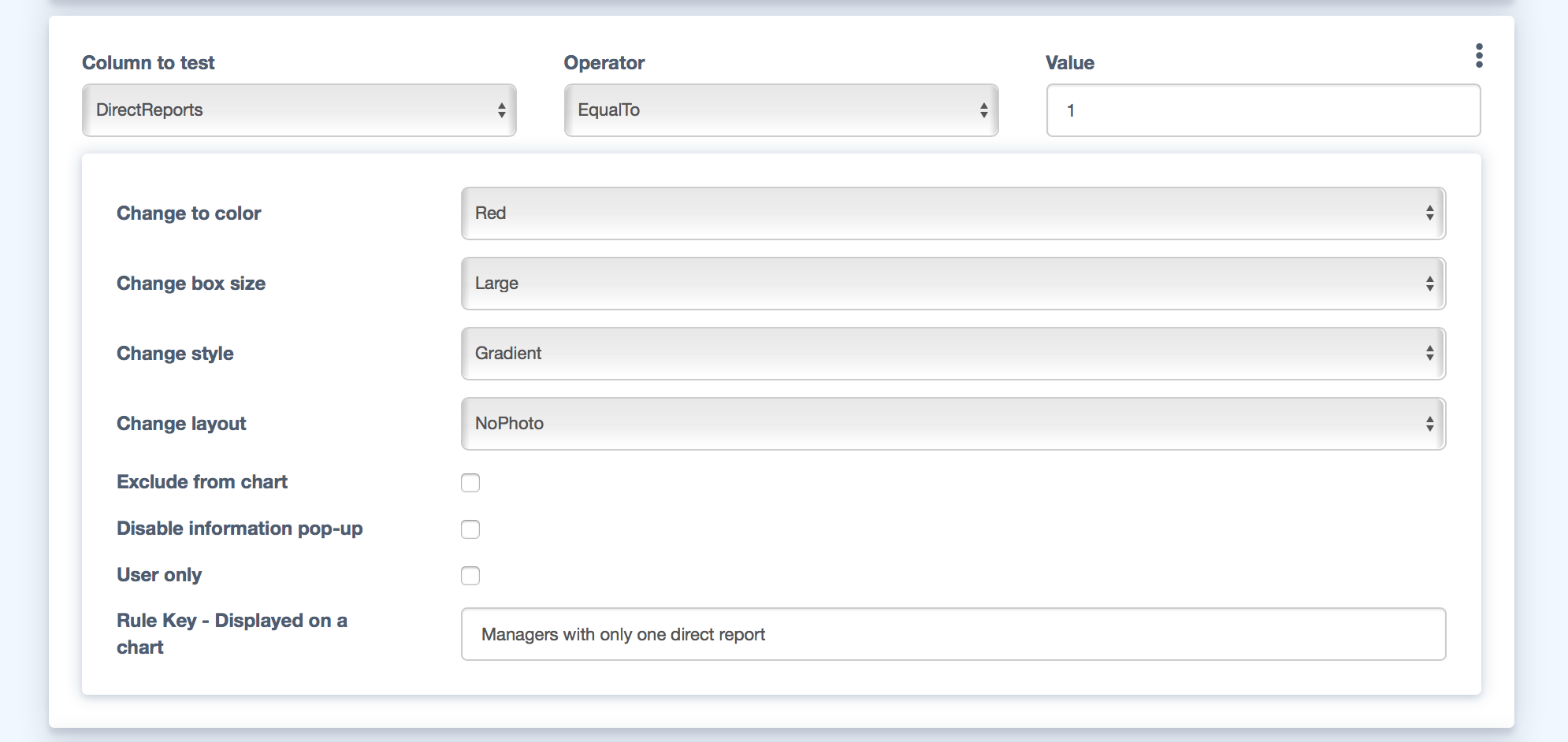
You can also use conditional formatting to alert you to certain conditions. In this example we want to see all managers who have only one report. This can be useful for corporate restructuring.
To do this, create a rule to test the "DirectReports" field of employees to see if it matches the value "1".
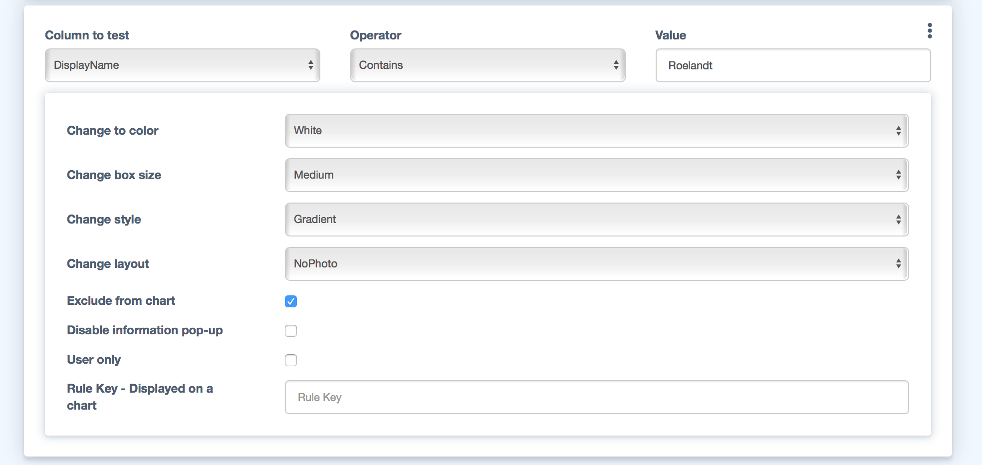
You can also use conditional formatting to hide employees from your chart. A common use case for this is consultants, who may only be with you for a short period of time or who don't sit conventionally within your organization structure.
In this example we search on the Consultants surname and choose the "Exclude from chart" option when creating the rule. We could of course search on another field to affect more than one consultant.
Once saved you'll see the consultant is now missing from the chart. To restore that employee simply delete the rule on the conditional formatting page.

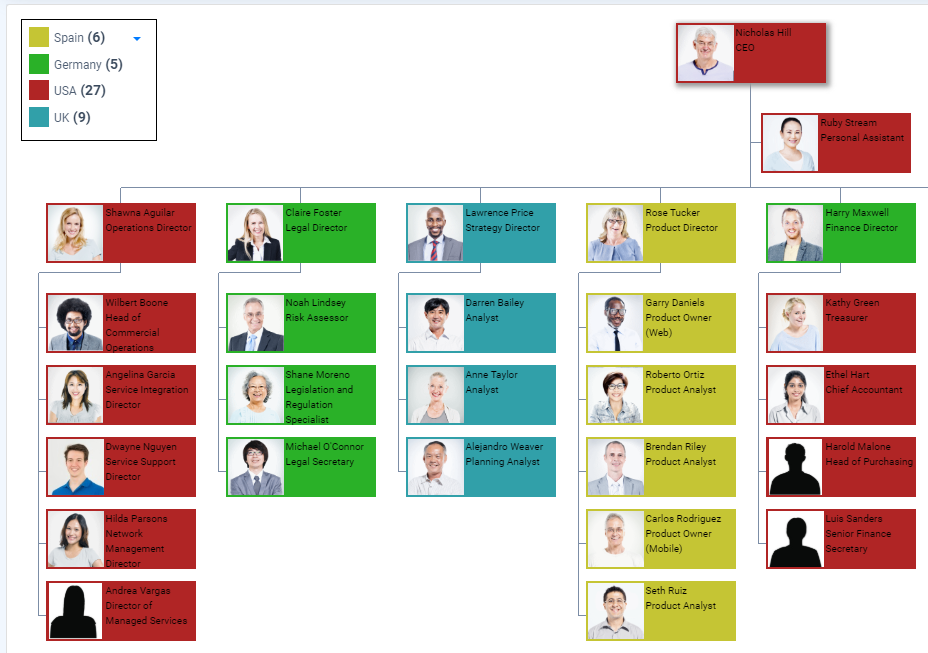
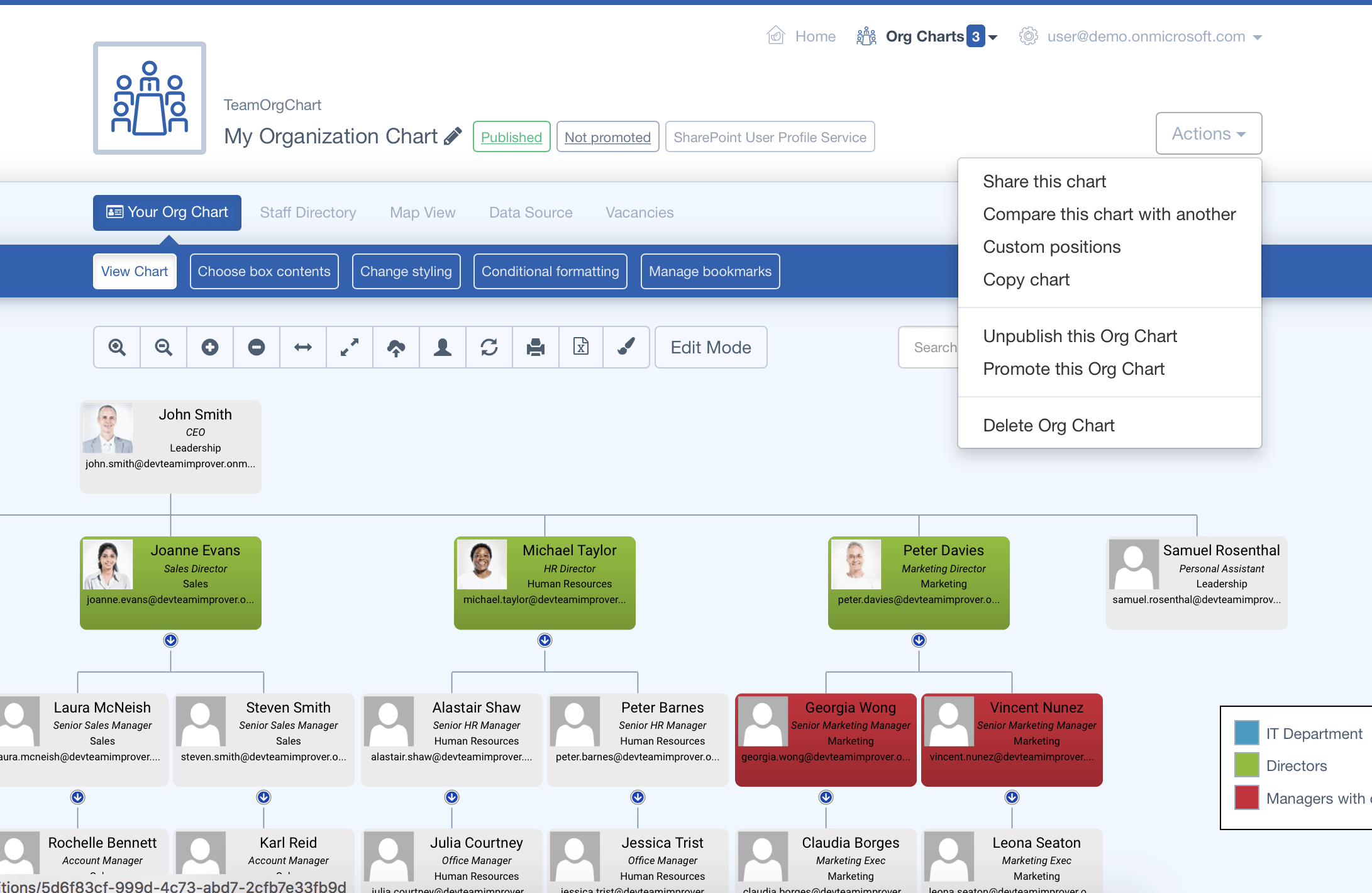
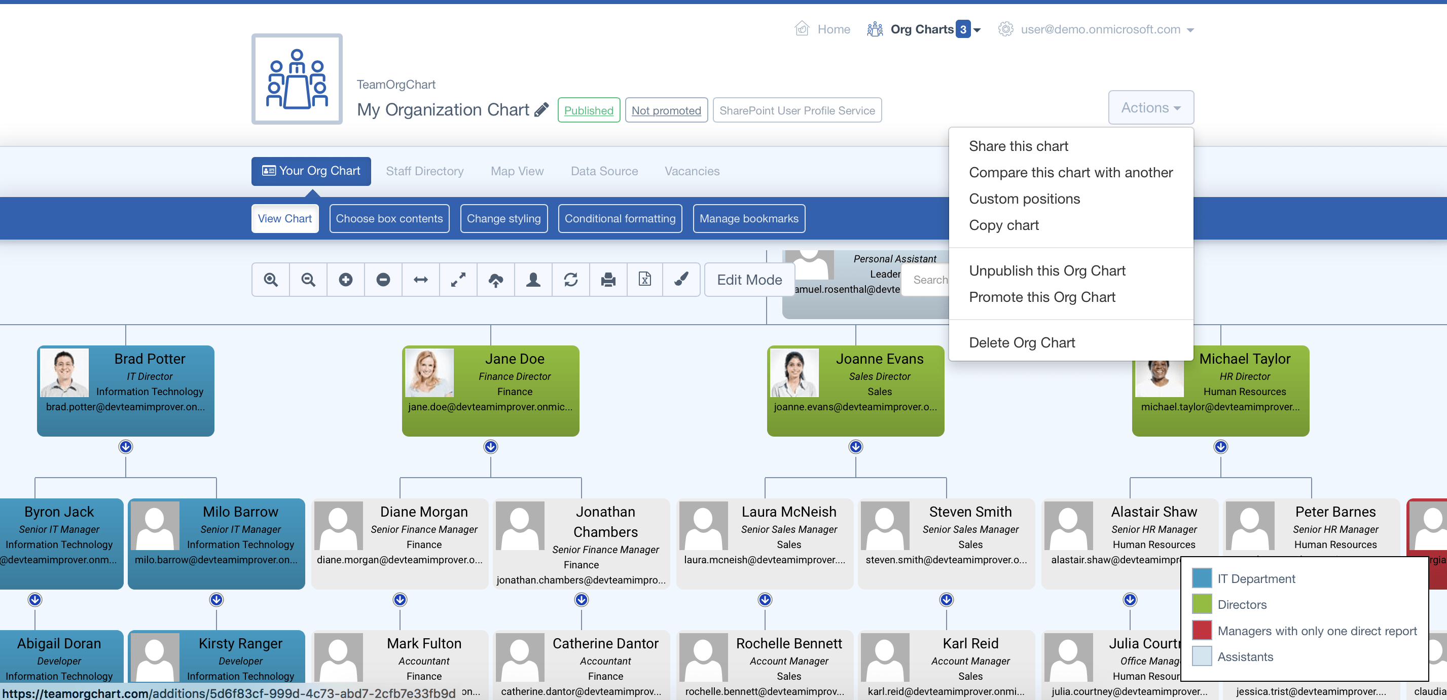
It can often be useful to change the position of assistants and co-ordinators to reflect their status in the organization and differentiate them from other employees that meet a conventional charting structure.
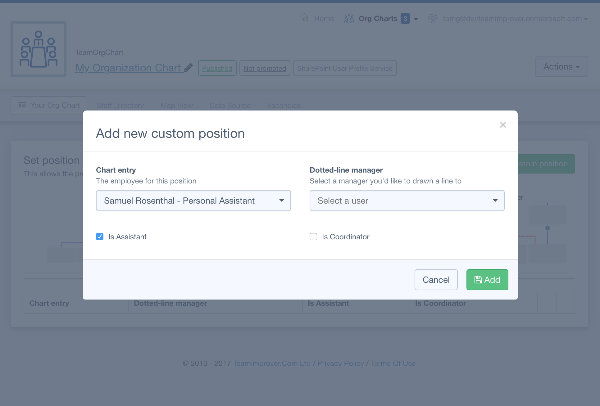
To do this, click the "Actions" button at the top right of your chart and choose "Custom Positions". On this page choose "Add new custom position", then use the dialog to select your desired employee and check the "Is Assistant" box before saving.
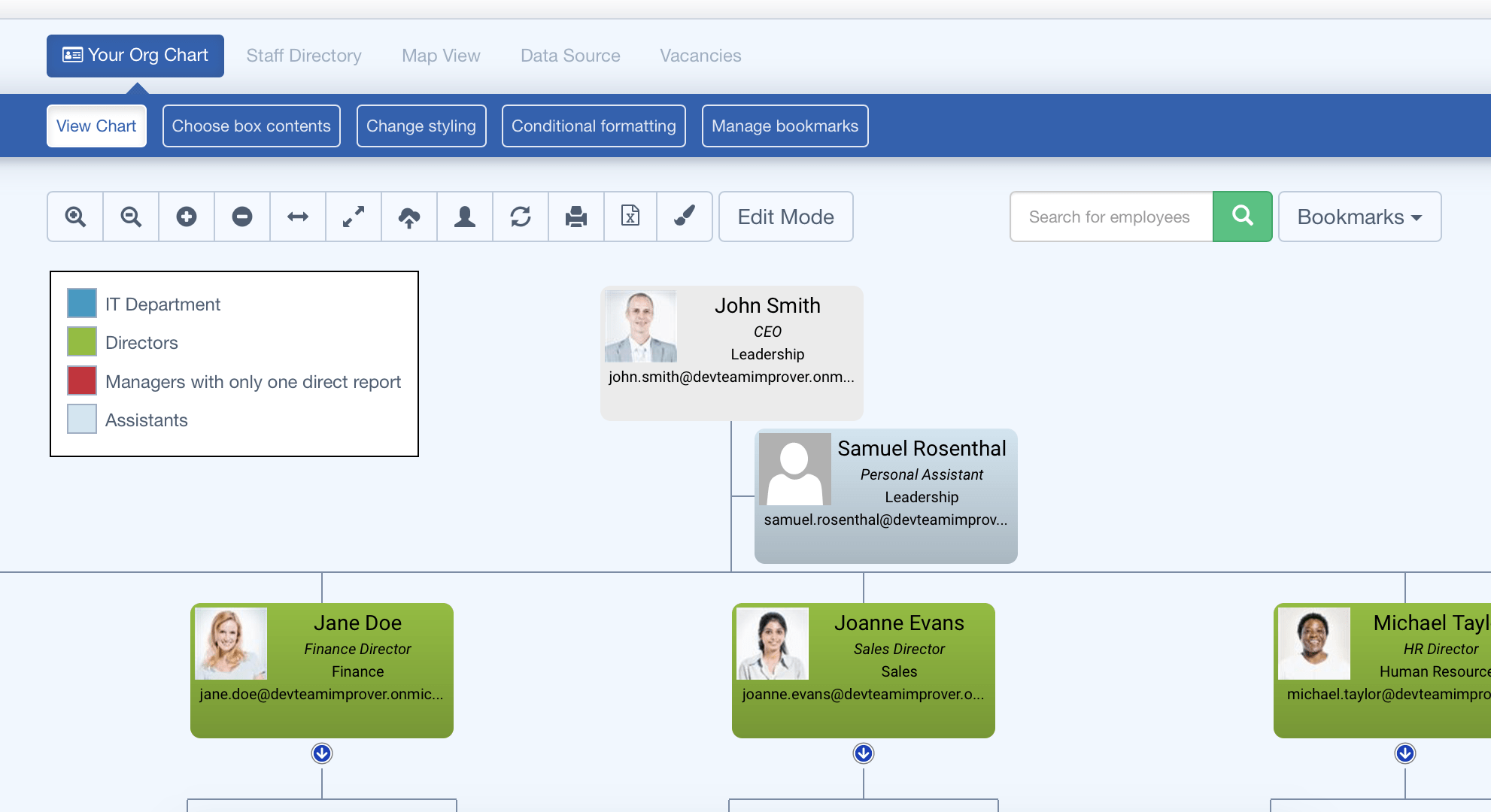
When you return to your chart you'll see this employee is now presented between the chart levels to reflect their Assistant status.
Note: In this example we have also styled the Assistant box using conditional formatting with the IsAssistant rule.
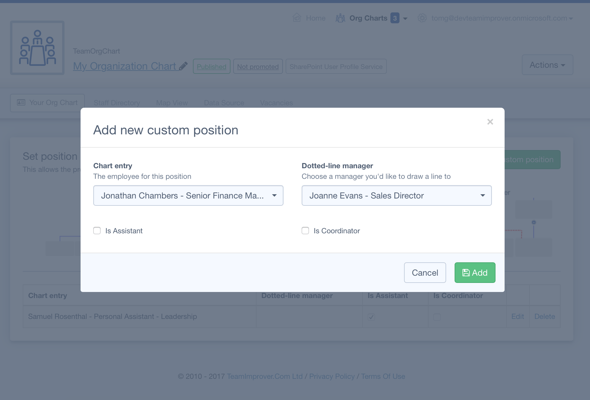
We appreciate that sometimes organizations have a more complex reporting structure, which is why we added the "Dotted Line Manager" feature to TeamOrgChart.
To create a dotted line management relationship visit the Custom Positions page as above but this time enter both the subordinate and manager into the new position dialog.
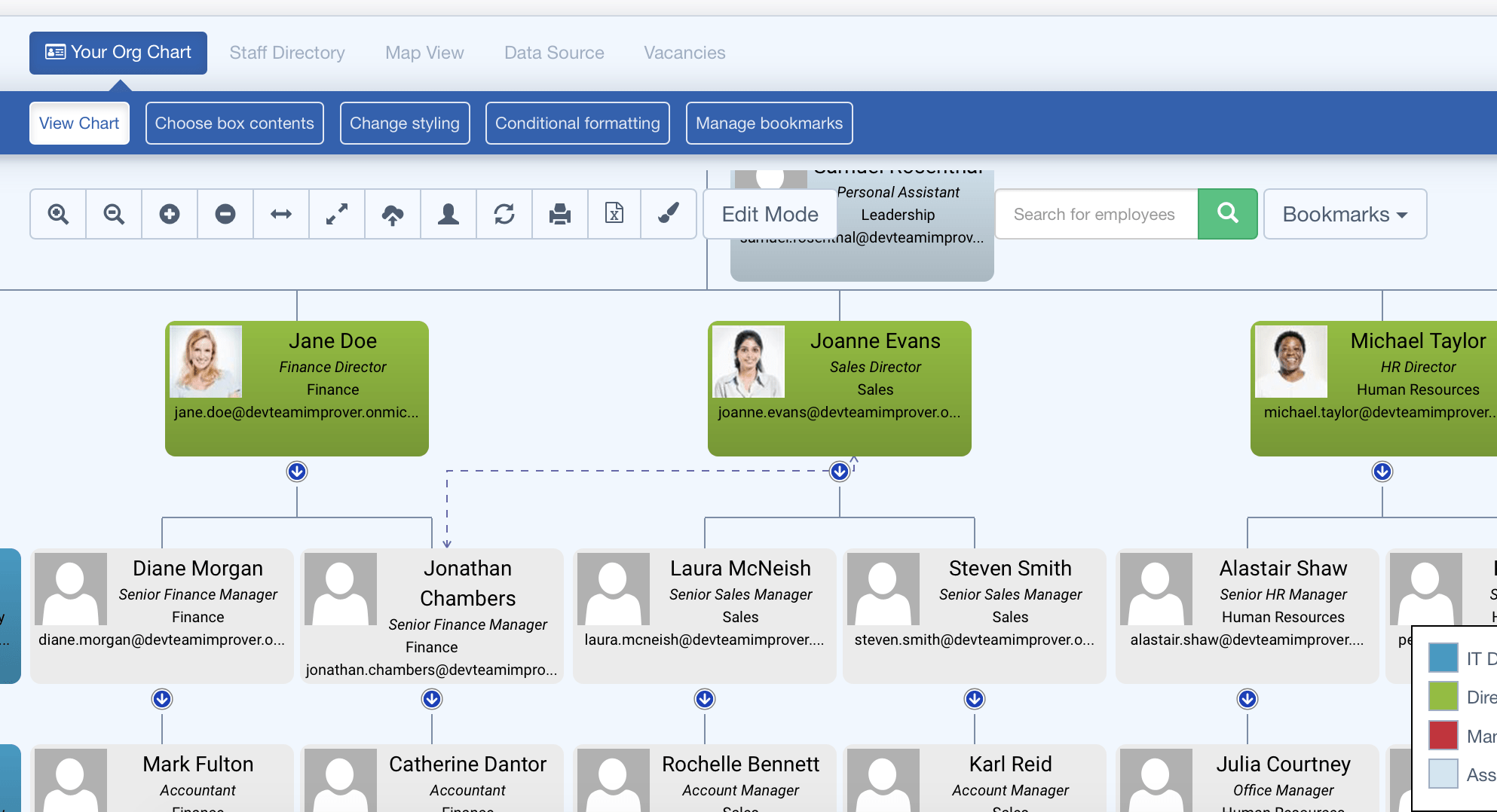
When you return to the chart you will see the dotted line relationship has been created.
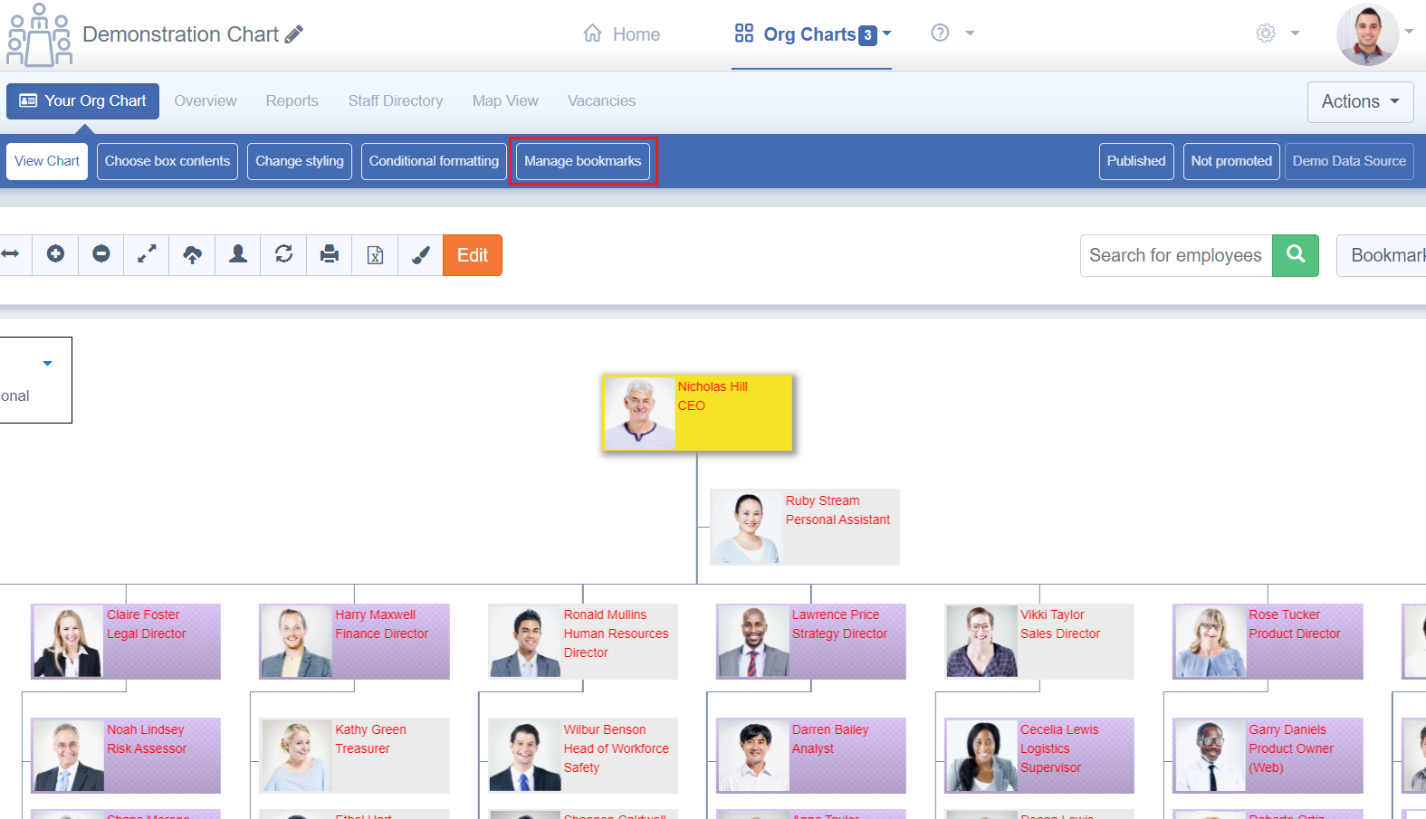
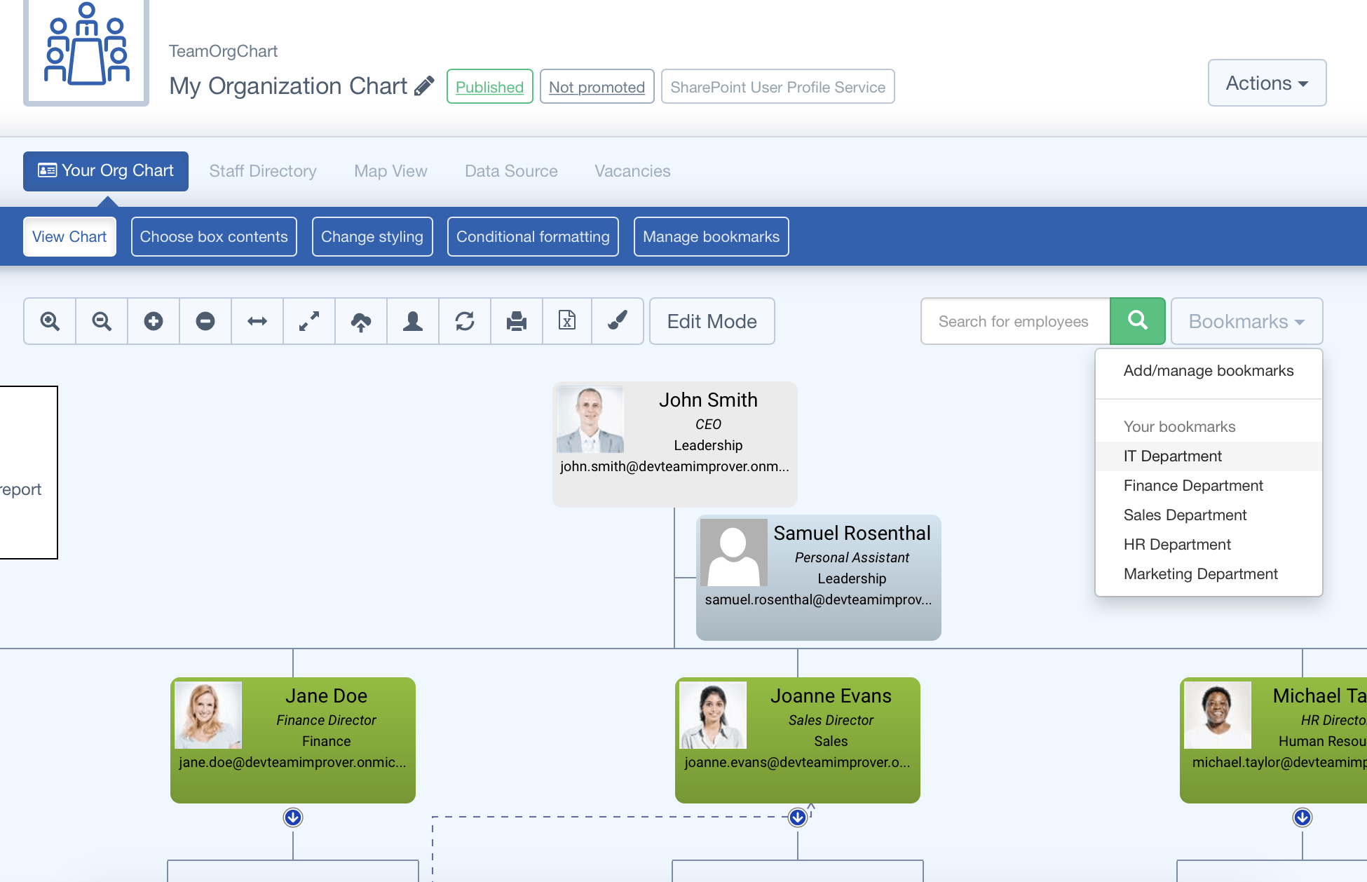
Finally you can use our bookmarks feature to save points on the chart so that you and/or your users can quickly find different points in your organization. Typically this is used to create shortcuts to departments. This can be achieved by following the instructions below:
- On the chart navigate to the location you want to bookmark (using the blue up/down icons to place your new start point at the top of the chart)
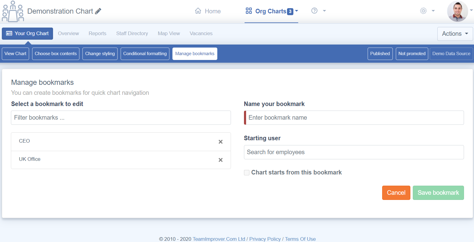
- Click the bookmarks button near the top right of your chart and select "Add/manage bookmarks"
- Name your bookmark in the dialog that appears and choose "Add bookmark"
- Repeat the process as many times as you'd like.
There's plenty of other functionality you can use to create powerful organization charts within TeamOrgChart. For more info please refer to our guides page or take a look at some specific articles below: