Styling your charts
It's easy to style a TeamOrgChart chart to meet your organization's needs. This page details all of the customization options available.
Accessing the styling page
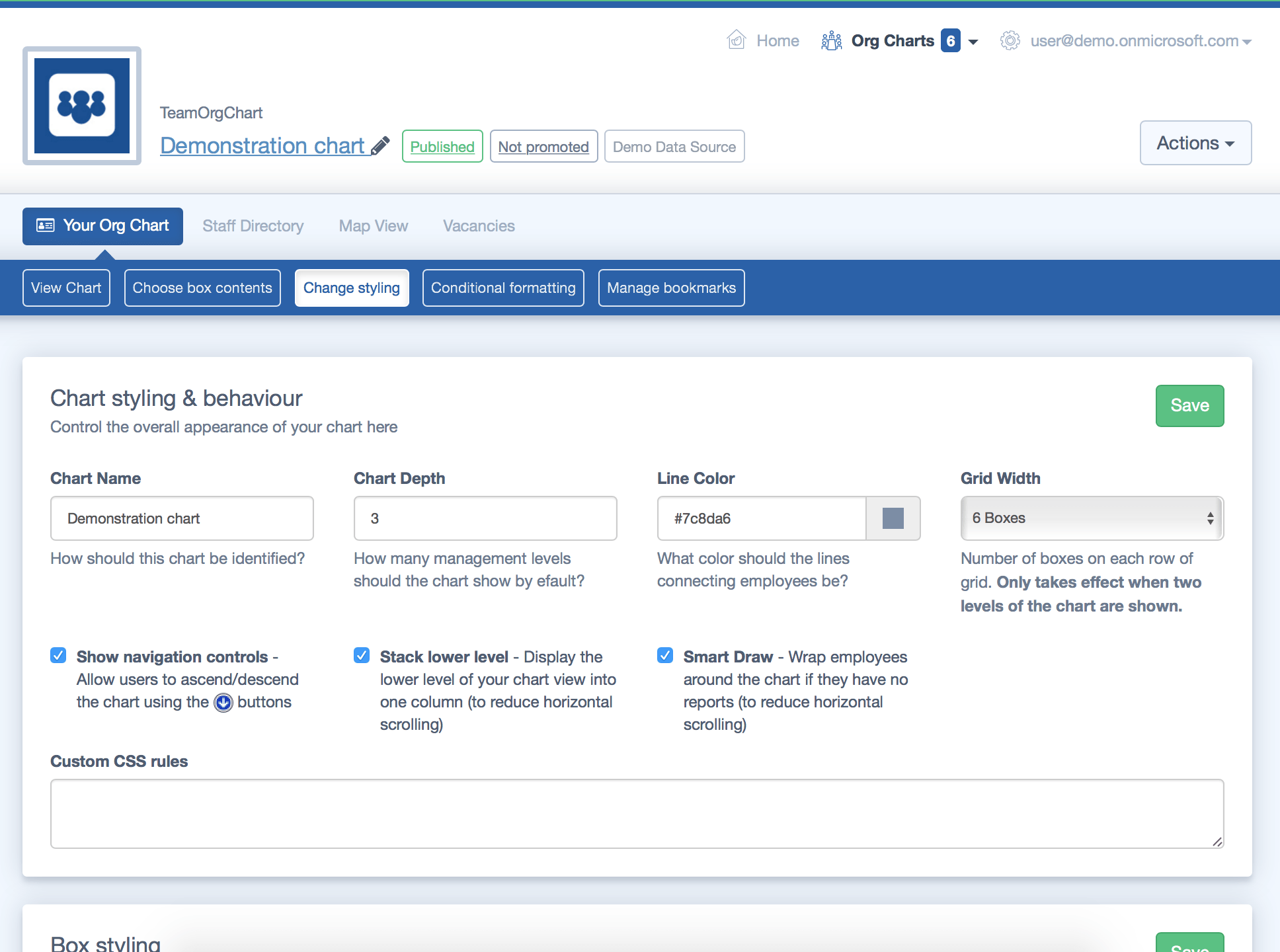
To access styling options simply navigate to your chart and select the "Change styling" page. This guide will cover each of the areas available

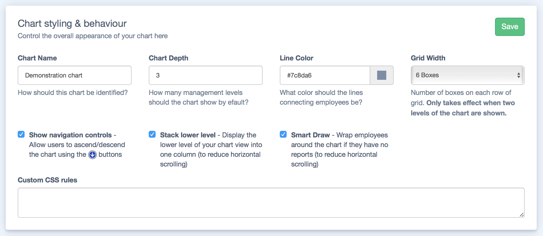
Chart styling and behaviour
- Chart name: The name of the chart
- Chart depth: Control how many levels deep the chart shows by default
- Line color: Choose the colour of the line between the chart boxes
- Grid width: This feature wraps the width of the chart when there are only two levels shown.
- Show navigation controls: Choose whether the blue arrow buttons are shown on the chart
- Stack lower level: Wrap the lowest level of your chart to save horizontal space
- Smart draw: Wrap employees around the chart if they have no reports (to reduce horizontal scrolling)
- Custom CSS rules: Enter CSS here to further configure the chart to your needs.

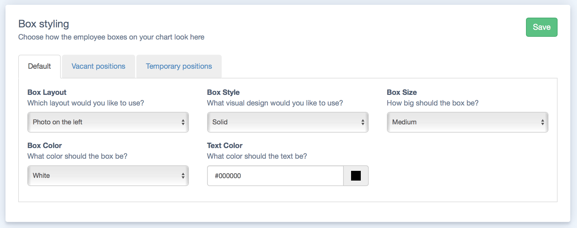
Box styling
The options in this area control how the chart boxes are styled under different conditions. "Default" refers to the standard presentation of chart boxes. The options in the Vacant and Temporary tabs style chart boxes with those vacancy statuses.
- Box Layout: Change the layout of the contents of each box. For example the photo can be shown on the left, right or centre of the text or not at all.
- Box Style: pick from a range of styles such at 3D or Hatched.
- Box Size: pick from either small, medium, narrow or large. If none of these are suitable picking custom will allow you to enter a customized size.
- Box Color: Pick from a range of colors, or choose Custom and then pick your own
- Text Color: the color of the text within the boxes

